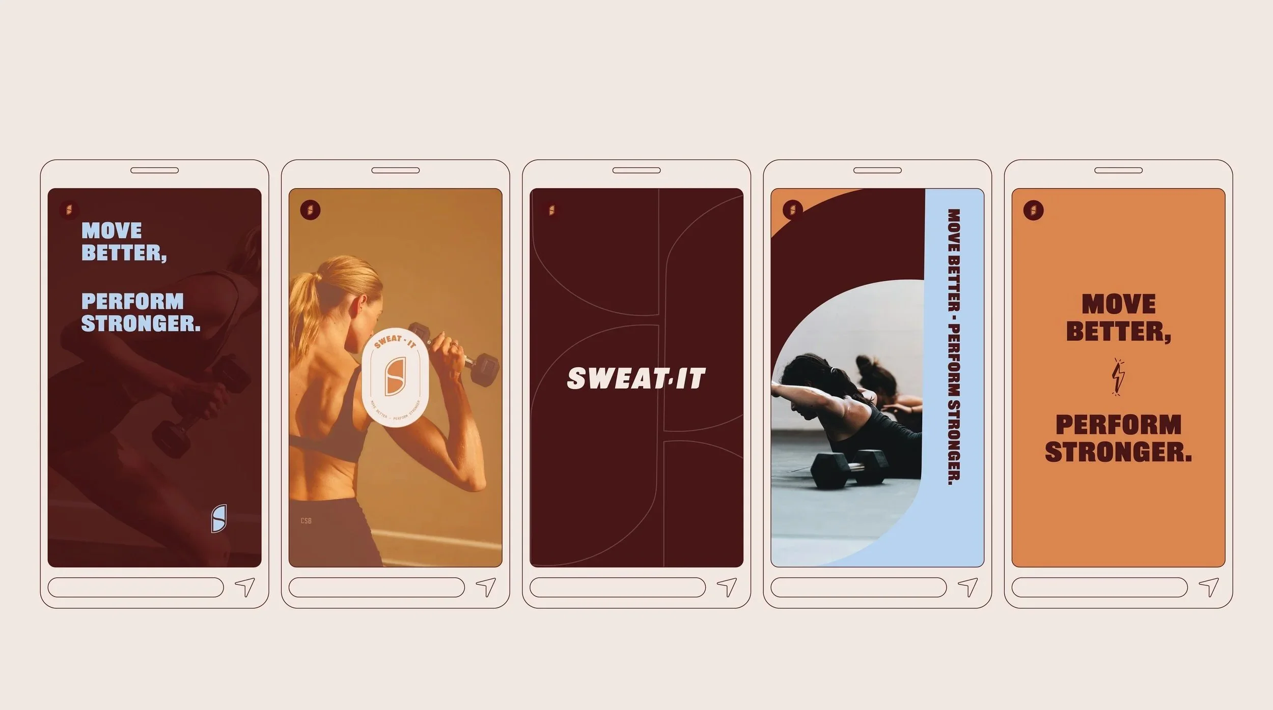
Sweat It
Sweat It Coaching is a Perth based coaching business focused on helping women move faster and lift heavier through athletic style training. Designed for women who want to perform, not conform, Sweat It goes beyond aesthetics to build real strength, power, and energy with purpose. Through structured, performance driven, and science backed training, clients are supported to become confident, resilient, and capable, both inside and outside the gym.
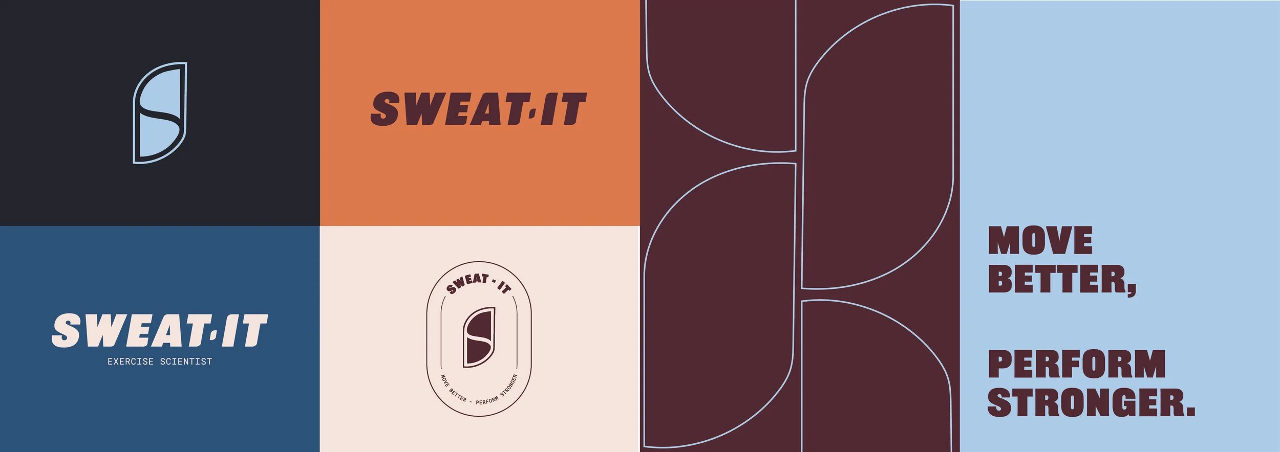
The visual identity is built around a strong yet balanced colour palette, with deep burgundy conveying strength, resilience, and a premium edge, while still maintaining approachability. Soft beige adds warmth and a welcoming feel, blues bring clarity, focus, and energy, and orange injects motivation and drive, reinforcing the brand’s dynamic, performance-led nature.
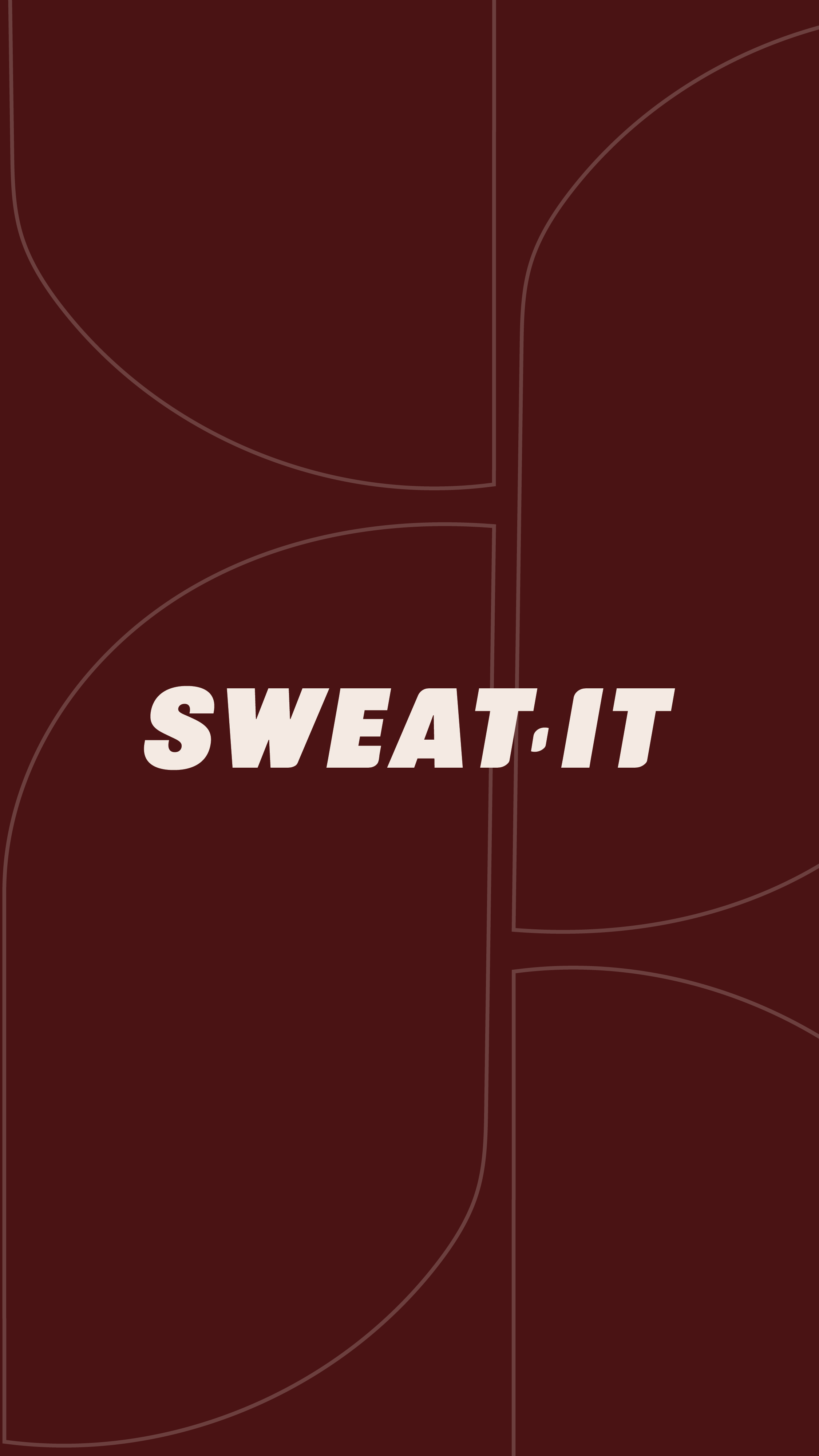
The logo system features a clean, bold wordmark designed with a strong sense of movement, customised to incorporate the brand icon shape within the letterforms for a cohesive and fully bespoke finish. The brand icon, drawn from the “S” in the name, is carefully balanced and symbolises dynamic movement across sport and exercise, reinforcing Sweat It’s athletic and powerful positioning. The icon has also been utilised into a seamless brand pattern.
Kind Words
“Lauren created me the most incredible branding for my PT business! She was quick on the ball and listened to all the aspects I wanted, whilst using her knowledge and creativity to enhance my ideas! She was incredibly accomodating and communicated with me so well! Would highly recommend and I will be reaching out for designs in the future! “
Sarah, Sweat It
